All things web
Lavantic
The Lavantic logo is built on a conceptual fusion of lava and antic, expressing creativity, energy, and controlled disruption. At its core, the mark draws from the inverted letter “V” in the Lavantic name, reinterpreted as the silhouette of a volcano—an enduring symbol of power, creation, and transformation.
This form is rotated and repeated to create a dynamic explosion motif, representing the ignition of ideas and the outward impact of digital innovation. At the center of the composition lies a square of negative space, intentionally designed to resemble a pixel. This pixel symbolizes the digital foundation of the company and represents the core from which all creative and technical solutions emerge.
Together, the logo communicates Lavantic’s identity as a web design agency that blends raw creative force with precise digital craftsmanship—where bold ideas erupt from a strong, focused technological core.
Agency
-
Client
Lavantic
Scope
Branding
Industry
Web Design Agency

An eruption of ideas, powered by pixels. Lavantic blends raw creative energy with a sharp digital core.
1.1.1
Logo Construction
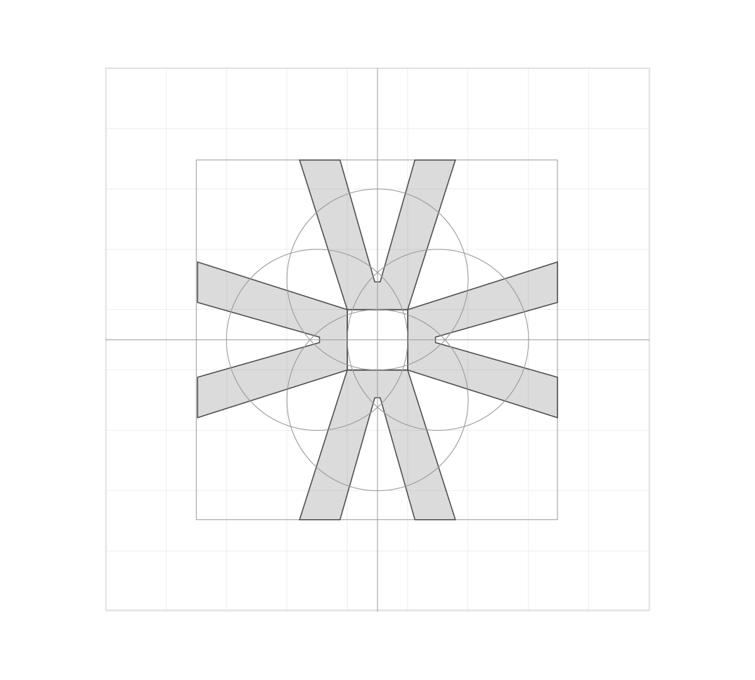
The Lavantic logo is constructed using a precise geometric system based on a square frame, axial symmetry, and intersecting circular forms.
This results in a mark that feels engineered rather than illustrated, with every angle, width, and curve traceable back to the same underlying geometry.
1.1.2
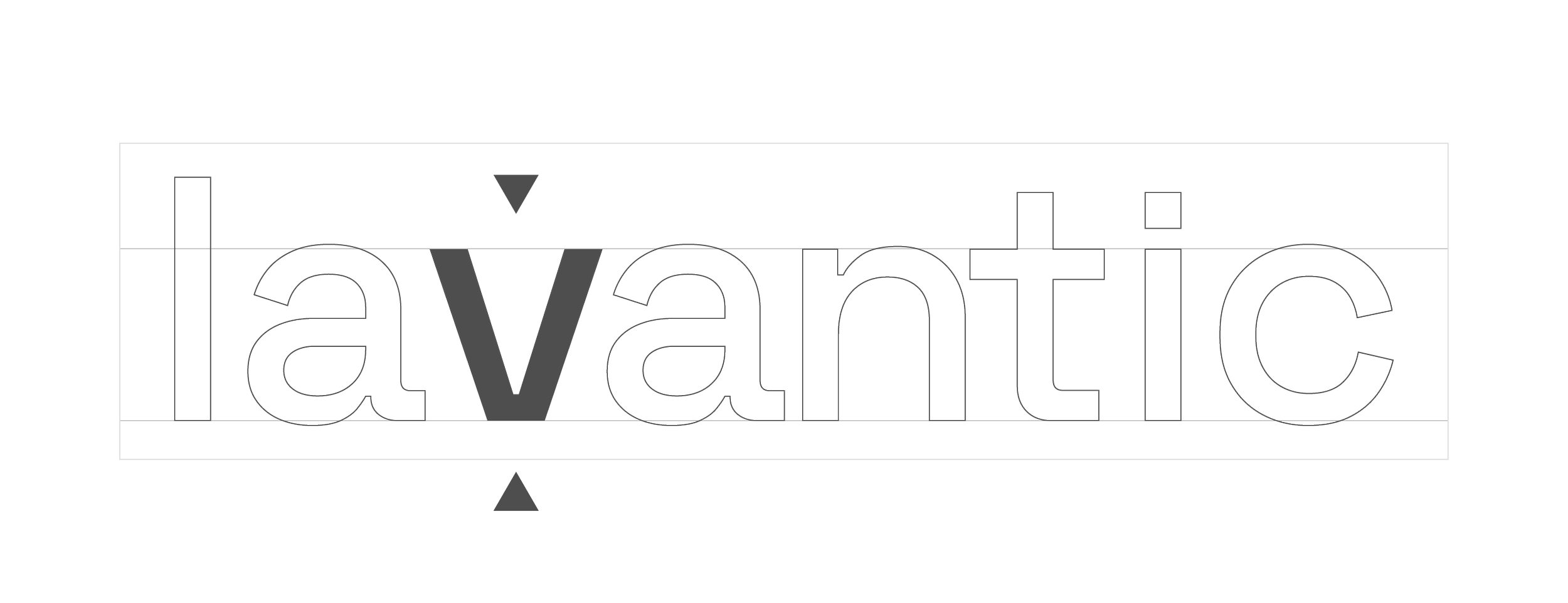
Minimum Clearance
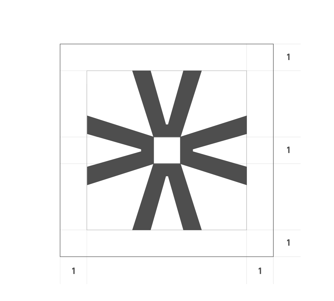
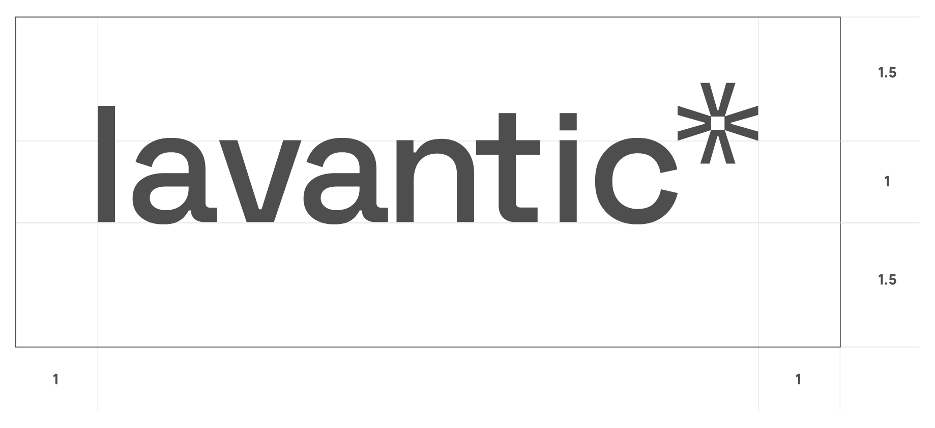
Clear space is defined using a proportional unit derived from the logo itself.
The unit 1 is equal to the height of the square within the motif or the height of the lowercase letters in the Lavantic wordmark, measured from baseline to x-height.
1.1.3
Typography

The Lavantic typographic system is designed to reflect clarity, precision, and contemporary technical character. It is built around two complementary typefaces from the Space family: Space Grotesk and Space Mono.
The shared visual DNA of the Space family ensures harmony between headline and body text, even when used across varied applications. This consistency allows Lavantic’s typography to feel intentional and unified rather than decorative.
1.1.4
Colour
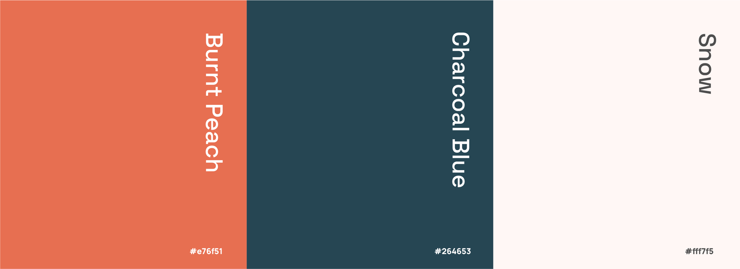
The Lavantic colour palette is a balanced, contemporary system built around warmth, depth, and clarity. The combination of peach, deep teal, and soft white creates a distinctive visual identity that is both confident and refined.
The palette is intentionally minimal, ensuring consistency across all applications while allowing flexibility in layout and expression. When used according to hierarchy and contrast guidelines, the Lavantic colour system delivers a modern, confident, and approachable brand presence.
1.1.5
Final Logo
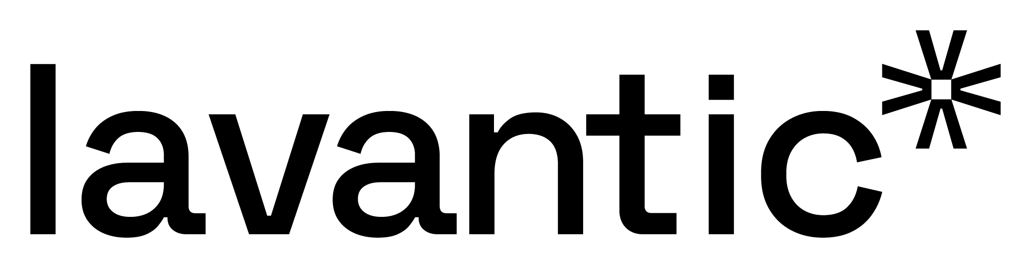
Lavantic is represented by a clean, modern logo built around balance, motion, and precision. The mark combines a bold wordmark with a geometric symbol that radiates outward from a central core, expressing growth, connection, and forward energy.
The Lavantic logo is designed to function confidently across digital and physical environments, maintaining legibility and impact whether used independently or as part of a complete brand system. Its simplicity and structural integrity ensure longevity and consistency as the brand evolves.
1.1.6
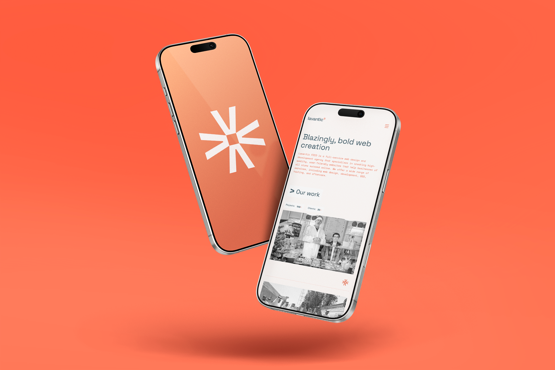
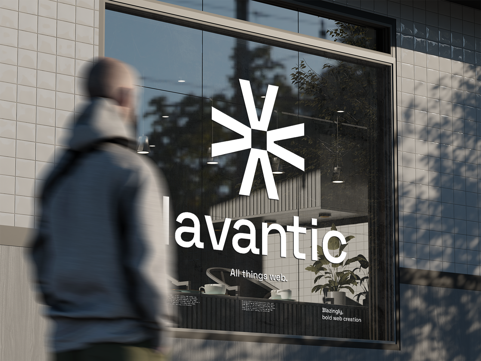
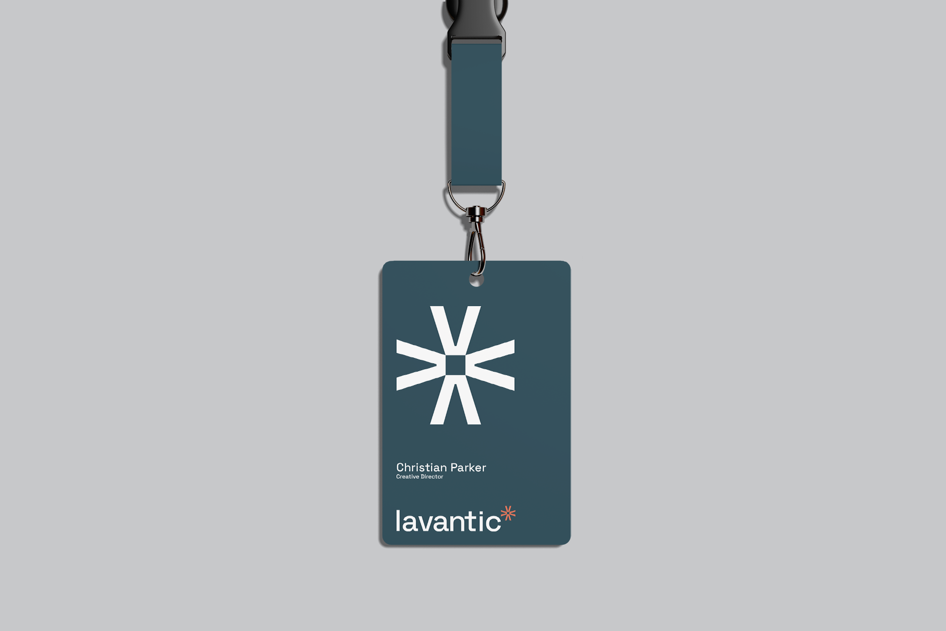
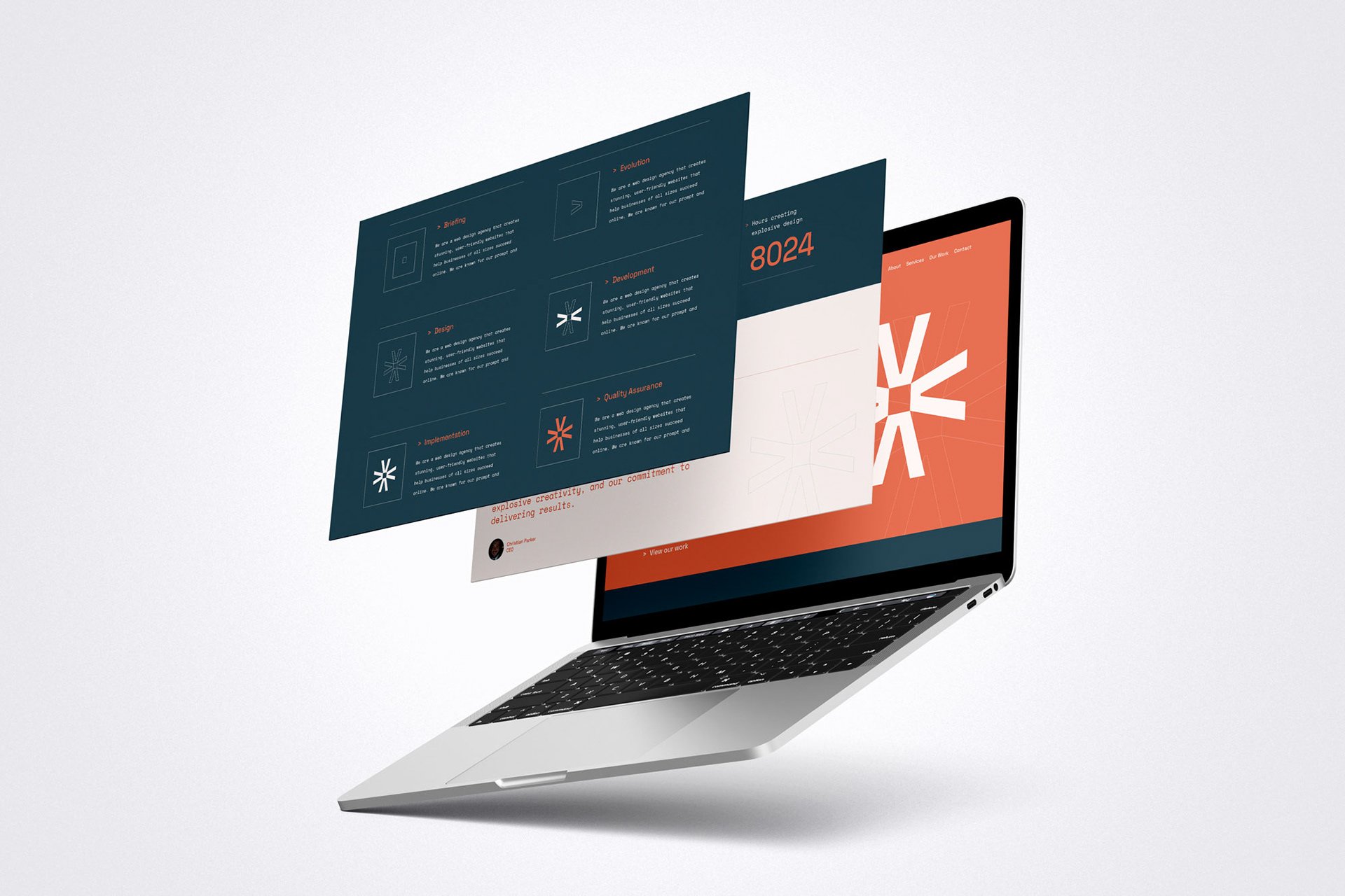
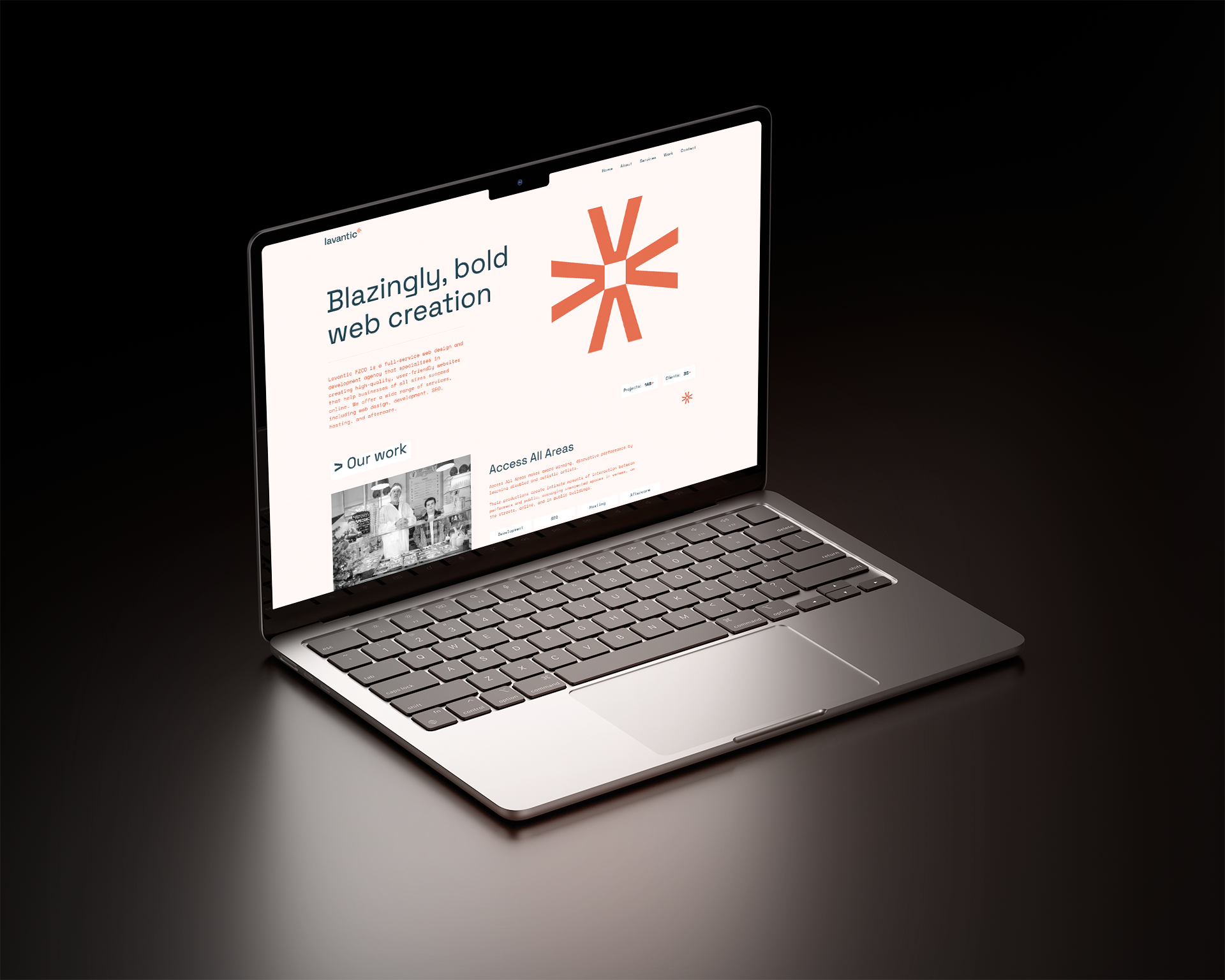
Mock-Ups
The following mockups demonstrate the Lavantic identity applied across a range of contexts, showcasing the logo as a cohesive and adaptable brand element.
Each application highlights the logo’s clarity, balance, and geometric precision when placed in real-world environments.